Final Project Reflection – Pilbara Indigenous Language Map – u3068541

The Pilbara Indigenous Language Map intends to be an easy to use portal to access information regarding the many languages of indigenous peoples of the Pilbara region in North Western Australia. This project aims to build on the data provided by the AUSTLANG Indigenous Languages Map, which is an excellent national database of Australia’s indigenous Languages, and the Wangka Maya Pilbara Aboriginal Language Centre, which offers in-depth information of the languages and cultures of the region.

Users of this map, should be able to browse the region, and sample portions of information relating to the listed languages. The information listed is intended to be a brief overview of the language, with links to further information from the Wangka Maya Pilbara Resource Centre. The languages listed are the top languages of the Pilbara region that still have fluent speakers, according to AIATSIS data.

In making this map I have attempted to explore the possibilities of a simple, humanities-focused interactive map as an alternative form of displaying data. I elected to use Carto mapping software, for a few reasons. It seemed to user friendly enough, whilst still being versatile and robust. It also has a variety of visual options built in, including various base maps to choose from, as well as different data-display options. Also, it’s open and free software with extensive tutorial information. Whilst making the map, I found Carto to be an excellent program overall, with only the occasional visual hiccup to be concerned about.

I did run into a few issues when creating the Language Map, most of which came from transferring data out of other data bases into Carto. The first, and likely most detrimental issues to the project, was collecting location data from AUSTLANG. Although all 1146 Indigenous Languages as recorded by AIATSIS have been mapped on the AUSTLANG language database, co-ordinates, and other geographical data is not freely accessible. The only location information is a visual pin on the inbuilt, google powered map, and the ability to search languages by state or territory. The AUSTLANG database also explains that the pinpoint locations are approximated. The obvious issue here is that the Carto software requires geographical data (latitude and longitude) to display information on the map. My workaround for this issue was to compare the AUSTLANG pin locations, with a separate google map, and as best I could mark an identical point on the second map. The latitude and longitude from the second google map was input into Carto to form new pin points. The issue here is that the location points used for languages in the final map are inherently incorrect, as they are approximations (based on locations that were approximated).

Reflecting on the map, I have thought of a different work around. To copy the pin point locations into Carto more accurate from AUSTLANG, I would create a screen shot image of the AUSTLANG map with the pinpoint of each language in the Pilbara marked. I would then take that image, and georectify it, using MapWarper. Once georectified, the image of the AUSTLANG map, would have the Latitude and Longitude information necessary to input into Carto. I couldn’t do this method because of time constraints, as one of the issues with the AUSTLANG map, is that it doesn’t display pin points well when looking at a large portion of the map, therefore, creating an image version of the AUSTLANG map would require taking multiple screenshots, and stitching them together.

This also brings forth an issue with using specific mapping points for a humanities project such as this. This project is intended to map language and culture of indigenous people, whose strong connection to land doesn’t  necessarily involve longitude and latitude data. My point here is that specific pinpoint locations don’t translate such intangible information, such as people and tribal areas, whose boundaries can be vague.

What I was happy with, was the information supplied by the Wangka Maya Pilbara Aboriginal Language Centre. Where AUSTLANG reads as quite dry information, Wangka Maya, being able to focus on around 20 languages rather than 1100, provides better descriptions of the languages, and the people that speak them. In an ideal version of this project, more of the resources from Wangka Maya, such as photographs of elders, and educational tools would be integrated into the map.

As far as meeting my original aims, I believe the map is on the right track. The simple layout and user interface of Carto displays the AIATSIS and Wangka Maya information in an easily digestible way for the user to browse. While I’m happy with how the map feels to use, the dataset needs serious expansion. I have only used languages that still have speakers, when users should be able to learn about any language that has been recorded. So not only should there be more data points, but each of the data points should have slightly more information. Photos and other resources should be directly accessible within the map. Also, AUSTLANG lists the connections between different languages and dialects, which would ideally be integrated into the map.

Overall, I am happy with the final product, but am painfully aware of the possibilities of such a project if it were to have deeper information inbuilt into the map, or even to have its scope expanded to a larger region. I believe a National version of the map would be an incredibly useful resource for people to explore the indigenous language and culture of their country.

Week 12 reflections (LAST WEEK!)

Alright here we go, the last reflection for the unit. I’ll open here by saying that I’ve found the themes and resources of this unit fascinating, and I think it has positively impacted how I think about not only digital heritage, but also heritage in general.

Anyway, lets move on to the last meme of the semester:

rickharrison

I really like Thomas Padilla’s language. I found phrases like the following inspiring.

“…rather the work is intended to build upon our commitments to support nothing less than the ability to experience life as worth living.”

What I also found inspiring is that in all three readings, and seen many times previously in the semester, we have seen projects that have sought to represent marginalised people, who are so often left out of traditional heritage lenses.

But as we saw earlier in the semester as, the same resources used to create projects that are ‘good,’ can be used to create projects that are awful.

I’m not quite sure where we stand ethically as far as restricting access to raw resources, such as Trove, but I assume we’re generally against it.

My point here is that although we can’t (and probably shouldn’t) restrict data from people, it is the ethical responsibility of digital heritage practitioners to create more projects that celebrate the diverse experiences of the world, than those that seek to divide.


Week 11

Ok this is unfair, I’m trying to get these responses done quickly, but then there iss a link to classic arcade games, and solitaire?! I’m not getting that hour back.

Jokes aside, functional archiving of digital material is fantastic, it really leans into the idea that heritage is best when holistic experiences are preserved, not just the evidence of them. For tangible heritage its a lot harder, keeping functional items functional, and able to be used by anyone, is often difficult or impossible. For example, keeping a 100 year old motorbike working, and letting anyone who asked a ride of that bike would not only be dangerous, but probably damage the bike itself. But anyone can play Sega’s Hang On.

Again, saving old websites, and UI’s and games, seems closely linked to ideas of intangible heritage. I mean, they’re pretty much intangible anyway being digital, but being able to preserve the experience of using Windows 3.1 is amazing, particularly when we live in a world of constant updates to software.

Week 10 Reflection

Hi all,

First off, who wants some honey? Making a 3D object with just your phone is great! Last week some items at work were being 3D scanned with a device and custom software costing a small fortune! Albeit, their model is significantly higher quality.

I’d like to talk about what happened at work with the 3D scanning for just a bit. The in house Multimedia team scanned an item for display, to then 3D print a custom mount. Pretty cool stuff I thought. I’ve also been a part of a conservation project, where we needed a 1:1 replica made of a small model of a first world war soldier, so we got one 3D scanned and printed. The newly printed 15cm tall model is on top of a Diorama in the First World War Gallery at the Australian War Memorial, in amongst models that were made 20 years ago, and you can’t tell the difference between them. Although, if you have a sharp eye you can see that two of the figures are holding the exact same pose. Little easter egg to look for if you’re ever wandering the gallery.

My point here, is that I’ve had multiple interactions where 3d scanning, and printing, and it has been a practical solution to common museum exhibition problems. So I don’t think 3d scanning and printing is gimmicky, although I am aware that there are solutions to those problems without the technology. Exhibition mounts and replica’s can be made without 3D scanning/printing, its just more convenient, and accurate than traditional solutions, and 3d scanning is getting cheaper (see my honey model above which I made for for free).

3D Tours on the other hand, I’m not sure I’m sold on.

I like the idea of them, creating a 1:1 digital representation of a space is pretty cool, particularly when it is somewhere very hard to get to, like somewhere far away, or impossible to get to, like somewhere that no longer exists. But what always falls short for me is viewing a 3d space, on a 2d screen, just isn’t particularly immersive or interesting. Don’t get me wrong, it’s not that I think it isn’t possible for 3D spaces to be immersive or interesting, much the opposite; I’ve spent countless hours playing video-games because of their immersion. I understand that a fictional world is probably easier to make interesting than having to be confined to copying reality, but I don’t think i’ve ever seen a virtual tour of a site or museum that has come anywhere close to making me want to just explore.

Although, if I had minecraft downloaded on this computer I’d definitely be checking out the Gallipoli map made by Auckland museum. Seem like a great project.

I’m not sure about Heritage VR just yet. Not becauce I’m particularly skeptical, I just haven’t tried it yet. I’ve tried some VR, but nothing remotely related to heritage, but I can think there are some cool projects that are possible with the technology. As far as whether or not Heritage VR is a gimmick, I’m not sure, we’ll have to see after the tech is more accessible.

Anyway thats it for me.
Cya next time.

Week 9 Reflections

Good Evening

Running late again, so here we go.

Both the redaction art, and the face finding, made me think of other ways in which clever scripts can glean information from databases. Could programs search collections to help identify items? The idea being that the image of the item is being used to supply information, rather than curatorial data or tags. I’m thinking of physical collections rather than archives, however, I doubt that would be necessary, as most items photographed for collections should have descriptive information attached prior to photography right? I wonder what collections WOULD find that useful. I guess that would make it a form of datamining, where the program is looking for images/shapes rather than text. I think it would be useful in some of the crowdsourcing projects we saw earlier in the semester on Zooniverse.

I work at the Australian War Memorial, where there is a running project to find portraits of all the first world war service personnel. I wonder if the collection has been searched with facial recognition software? Perhaps something to ask the curators tomorrow.

Also, here is my tweet for the Vintage Face Depot. Hmmmm

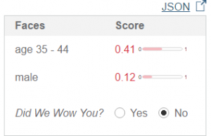
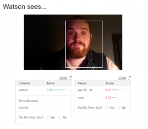
I just tried out the IBM demo system, and it’s pretty cool! Here is what it had to say about the same photo I used for Trove

watsonthinksofmePretty good, but I’m not particularly wow’d by how old Watson thinks I am.

watsonthinksofmeno

What sort of half-rate super computer can be thrown off by twelve years by just a little pre-mature balding?

Anyway, I couldn’t get the demo to work on the redaction data, I’ll have to try again later.

Goodnight all!


Week 7 Reflections – Maps

I’ve been reading this weeks post carefully, as I’m proposing to create a map for the project due at the end of semester. To be honest I think I’m out of my depth and I’m looking for ideas, particularly when it comes to how to make my visualisation ideas into a reality.

Link to Pilbara test map.

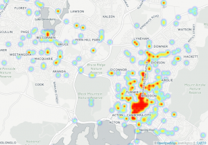
Here’s a heat map I made out of the ACT Cyclist crash data with Carto:

act_cyclist_crashes_1_by_u3068541_09_22_2016_08_09_00

Fiddling with the map settings in Carto seems both incredibly useful, but it some ways, illicit. Just by adjusting how the data is represented, I can paint a different picture, without altering the data. For example, with the heat-map, I can increase of decrease the size value of each crash. Increasing the size of each point, increases the ‘heat-density’ of Northborne Ave significantly. I’m not altering the data, but the perception of the data, but when I’m using a map such as this to represent data viewers might not look at, is there much difference?

I’m currently trying t make a rectified map of Canberra using Map Warper, but I’ll finish my post while the jpg. is loading.

Certainly some interesting stuff this week, and incredibly useful for my project proposal (which I better get back to writing).

Thanks
Aiden


Week 6 Reflection

Good Afternoon,

Here we go, Data visualisation. Whilst working though the various visualisations this week, I was thinking about how I could use these in terms of the proposal due very soon, and I think many of these will be quite useful. For my project, I’m thinking of using AIATSIS and AUSTLANG data on indigenous languages of Australia. I’ve seen plenty of language maps, such as this, and I’m trying to figure out what I can bring to the table. All I can say is that most of the visualisations i have seen have been static, perhaps I can create a more interactive version of the map I’ve just linked? But what would that look like? Let me know if this has been done and I just haven’t done my research.

Anyways, here’s proof that I did stuff for week 6.

Internet Access by Age – Pie Chart & Column Chart

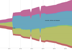
Trove Work Counts 2010-2016 – Plot.ly Stacked Bar Graph

RAW:trove-work-counts-2010-2016-raw

Trove Closed Links – Fusion Table

When I was testing out the physics of the fusion table (which is mesmerising) I shook one of the major points, and a triplet of point shot out from the rest, showing that those three closing reasons were only ever used with each other. That’s something I probably wouldn’t have noticed had the chart been static, let alone from the raw data.

Alright, better get on to the proposal.

Cya!

Week 4 Reflections

Another week, another strong feeling that I just don’t have a handle on the digital side of digital heritage. Tim’s paper on Maps and Pins was fascinating, however, it’s the concepts I like, but struggle to get around how to practically tackle a project such as adding faces to Archives searches.

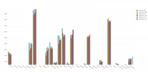
But small steps I guess, and here’s one of them, my first attempt at plotting data with Plot.ly. Ok so that hyperlink isn’t fabulous, but here’s a screengrab of the bar graph from the data representing populations of Males and females in tasmania, broken up by town and year using census data from 1881 to 1901.

Week 4 Plotly Test

Open Refine seems incredibly useful, particularly when looking over the data from the Tasmanian inquests. Using open refine, the ‘free form’ descriptions of inquest findings could be collated and, well, refined to provide more practical information. Really cool stuff, but I still have to get my head around CSV’s, API’s and most other acronyms we’ve run into.

Cheers,
Aiden

Week 3 – Thoughts on searching.

Hi,

After reading Mitchell Whitelaw’s paper, it felt vaguely familiar. Then I remembered that I had seen his Tedx talk from 2010, in which Whitelaw explains the power of visualisation for digital collections. Whitelaw does an amazing job of conveying all the amazing aspects of these visualisations, and also being excited about the possibilities.

I certainly agree with Whitelaw, although Search engines have their strengths, they’re not the best way to show off a collection to someone who isn’t familiar. Funnily enough, my favourite examples of these visualisations, that Whitelaw is talking about, are the tactile displays at the NAA and the National Arboretum. If you haven’t had the chance to seem them, they’re both worth checking out.

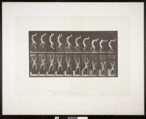
I would write more here but i need to go watch a GIMP tutorial so I can make a prize winning gif. My goal is to make this image of an acrobat from the USC Libraries loop, so he can walk on his hands forever.

Handstand0

Cya Wednesday

Aiden


Week 2 – Reflections

Afternoon everyone,
Seeing the power of access in Trove Traces was great. Being able to see what the vast information available on trove is being used for, is great. Projects such as ‘knowthatproperty.com’ wouldn’t have existed if it wasn’t for the incredible accessibility that trove offers. But with accessibility, comes some downsides, for the content made trove data is as good or bad as the user intends. I think the freedom to use the data how you wish is important, it is just a shame there’s a minority of people using it in hateful ways.
Zooniverse was really interesting! I was intrigued by many of the crowdsourcing projects; it was hard to choose one to try out. I ended up going Science Gossip. Science Gossip is dedicated to annotating images found in scientific journals of the Victorian era. I found the process really simple and easy to do, while also intriguing. I’ve thought about what makes me compelled to put more time into a crowdsourcing project like Science Gossip, and personally I think I’ve got three main reasons for doing so. First is that I find it fun! Science gossip gave me a few intriguing images to annotate, and the curiosity of what the next image could be made me want to keep going. Second is the idea that I’m helping such a huge project, the idea that a small amount of effort on my part, combined with the effort of the ‘crowd’, can do something bigger than any project team could manage on their own is fantastic! Thirdly, the ease and accessibility of the website makes it compelling, it’s incredibly easy to be a part of it. I hope others found it compelling enough to try again, I know it has been for me.
As a 20-something, I’d like to think I’m fairly proficient when it comes to social media. That said, Twitter was the only major social media I didn’t have an account on. Not anymore. I quite enjoyed the twitter bots we looked at, particularly the New York Public Library Emoji Bot. Simple fun, while encouraging engagement with collections, what’s not to love.
Ok, that’s it from me, lets see how week 3 is.
Cheers,
Aiden

css.php