Week 12 Reflection

As far as class went this week I spent a great deal just trying to finalise my tools for my website. This unit provided me with a surprising amount of techniques used to collect and display data. This definitely made the choices I made for my final assignment more simple.

I’ve definitely enjoyed this unit this semester. The way that we were allowed to slowly learn skills and build on them each week made in useful when I was learning new techniques like GIF making and 3D Modelling.

The three questions that we were asked to dwell on really drove home the point that the techniques that we learned in this unit are likely to become more prominent. As the future of cultural heritage continues to expand, it is our job as future conservators and heritage associates to grow with it. Many of the implications for the tools that we have explored in this unit, or used in our assignments have barely begun to be explored. This unit has really helped to open my mind in terms of some of the different ways that technology can be used to assist and identify different heritage processes. I must admit that digital record keeping is a part of the heritage sector that I will hopefully continue to have an interest in, if only to see the new and wonderful ways that technology can be used for heritage collections.


Week 9 Reflection

This week basically served to remind me of a whole bunch of internet memes. The Redacted art was a really cool thing I’d never thought about before and I think my favourite from the series that was included was the Ship doodled on the government file.

As far as recognizing faces go, all I could think of was that prank where people go putting googly eyes onto various inanimate objects. Its one of those things that never fails to bring a smile to my face.

All that being said the use of computers for recognize faces is not something that should be that foreign of an idea. Image storing services like Picasso use algorithms to identify different people in photos and suggest tags so that you can correctly identified in photos. This has lead to some humorous situations in the past where photos of my 11 year old self were confused by the algorithm as being the face of my 40-something Uncle. Not to mention apps like Snapchat would be unable to work their filters if they did not have some sort of facial recognition service.

As creepy as some of the uses for these tools can be, such as for security, you certainly can’t deny they can’t also be used for fun.

https://s-media-cache-ak0.pinimg.com/736x/37/b9/c6/37b9c62a771de84b428552cdd9227fba.jpg

Week 7 Reflection

Week 7 looked at interpreting data on a map by way of geo-coding. The geo-coding was something I had come across before in another of the units run by Tim in a previous semester. Consequently I did not find this class as difficult as I might have otherwise.

In looking at some of the examples used during this lesson I found that the interactive map “The Forced Migration of Enslaved People” was interesting to look at, but I found it a little frustrating to use. My frustration was mainly in terms of there being so many different things to look at on the one page. The multiple graphs combined with little to no direction in terms of how to use the website made for a rather confusing experience.

While I do not think that my data lends itself to this particular technique very well, I do still like the idea of being able to see the different data points placed on a map. I find that it helps to add an extra level of impact to the information.

Week 6 Reflection

Week 6’s workshop focused on the different ways to visualise data. I found it particularly useful in terms of my assignment and it gave me a few ideas of how I would want to assess the data that will be displayed on my website.

This week we were asked to examine a few different types of websites that create data visualisations in different ways and consider some questions. My favourite of the ones we were asked to look at was ‘The Preservation of favoured traces’ website which visually demonstrates the expansion that Charles Darwin’s ‘Origin of the Species’ throughout its various editions. While the visualisation was less useful for knowing exactly what was being added (especially as you could only see what was being added if you hovered over the different sections) it gave a really good overview of where sections were added and expanded upon as the science behind it developed.

This was also the week I was introduced to Silk which I went on to eventually use as my website host. And made me think about how I wanted to display the data. The various examples that were used this week helped me to make some decisions in terms of what I wanted to use. I was given a lot of food for thought this week as it forced me to think about the aims of my final assignment and about what I wanted to achieve.


Patience’s Final Project Reflection

The website I created for this final assignment is called ‘Artvisitr’ . The aim for the created website is to provide an alternate way of interpreting data included in The Art Newspaper‘s annual publication on most visited Museum and Art Exhibitions. My primary goal is to increase comprehension of the trends and visitor numbers that may be present from year to year. I hoped to do this by displaying the information in a variety of different ways including mapping the exhibitions by location and venue, as well as a break down of the most popular terms used in exhibition names for each year. Through doing these analyses for each block of data I hoped to expose trends in attendance as well as popular topics for exhibitions and so give insight into the world of cultural tourism.

I hope that the information contained and displayed on my website could be useful to industry professionals such as Art Curators and Exhibition Designers in terms of choosing topics for potential exhibitions. The information contained on this website could also be a useful teaching tool for University lecturers and students alike as it allows for the information to be interpreted as needed.

I feel like my project succeeded in its aims despite only being a sample of what I could potentially expand on. Through the analysis of Museum and Exhibition attendance over a number of years I was able to visually see the change in daily museum attendance, and how the visitor numbers were clustered. An interesting fact is that you can see visits to the cultural institutions went down in about 2010 which was in the middle of the last ‘Global Financial Crisis’. As a part of the most common terms breakdown, you can see that the words ‘impressionism’ and ‘Picasso’ appear a number of times in different years suggesting perhaps that there has been a resurgence of interest in the works of Picasso, and also in the style of impressionism.

I found this project relatively straightforward once I was able to decide on a topic, however technical issues proved, and continue proving, to be the most difficult part of the assignment. I used a variety of tools to create my assignment but the first and arguably the most important part was the conversion of my PDFs into Microsoft Excel files so that I would be able to import the files into my tools. In my original proposal I said I would use a built in file convertor that would adapt the tables of information I was using to a more versatile format. I found in practice that the PDF convertor was unreliable and so in the end I resorted to manually writing up the information myself. While this does potentially introduce more errors, it was simpler to do this manually than to go through a computer program. Also a choice I made in the creation of this assignment was to limit myself to the Top 100 results as I have been working on other assignments at the same time. It also meant that the website could serve as a sample of what it could be rather than a completely finished project.

I then used OpenRefine to clean up my data, but it was particularly useful for fixing errors in city and venue names. After looking at a variety of hosting websites I decided on using the website host Silk since it seemed to apply to most of my needs. This was mainly because the website has a large variety of built in options to display data in different ways. Options that I made particular use of included the scatter plot, as well as the ability to place the different venues on the world map and then size the points by number of daily visitors attended. I ended up using Voyant to make the word-clouds but since I was unable to work out how to properly embed the interactive graphs into Silk I had to save them as a PNG and manually import them into the website pages.

Unfortunately Silk has proven to be buggy in a variety of ways. When originally importing my data packs into Silk, on multiple occasions I had to continually re-upload my data files to get them to display correctly on the website and allow me to use all 100 of my points for each year. Another problem I have been having is that my imported word-clouds are not displaying correctly on the public versions of my web pages. When I log in and use the website editor everything looks fine. However this problem currently seems to only be affecting my own laptop as the word clouds display correctly when I visit the website on my phone.

In creating this project I also had some technical issues with the use of Voyant where word-clouds would fail to correctly display the most popular words in the data group. To combat this I had to re-upload the text to be analysed until the correct words appeared in the word-cloud. I do not regret using any of the tools I have used for this project but feel like there is opportunities for improvement in many of the tools I have used.

I feel like I have succeeded in my aims but there remains plenty of options for expansion in the future. For this assignment I only analysed the published results for the years 2009, 2010, 2011, 2013,2014, and 2015. However the summary has been annually published since the mid 90’s so there remains plenty of opportunities to expand, not to mention the fact that the summary is published yearly so there could be some future work in keeping the website current and up to date. . Another way I could possibly expand the website is to publish the total results for each year instead of only the Top 100 figures as this would provide an even more expansive view of the trends in cultural tourism and exhibition topics.

Another feature I might like to add in future is the opportunities for visitor feedback, in terms of a comment or suggestion section that allows for people to request different versions of the data. That being said, Silk already allows visitors to change how the information is viewed using the ‘explore’ tool.

To conclude, I really enjoyed working on this assignment despite all the frustrations involved with the technical side of things. It was really fascinating to see how the trends have changed in just a few years with such a small sample size. The potential for this website is huge, but only time will tell if I choose to expand on this project.


Week 5 Reflection

The most enjoyable part of this weeks lesson was looking through the various Australian Election speeches. In searching different words I found it unexpectedly enlightening to work out what it was referring to. For example I searched the word ‘cheese’ thinking it was going to be rather amusing and discovered when looking through the speeches it referred to that it was mentioned when talking about the Dairy industry. Just in case you were interested the word ‘cheese’ appears most often in 1958 in the speech by Herbert Evatt, who mentioned it 4 times when talking about the losses experienced by the Australian Dairy industry during that time period.

The most intriguing search for me was looking for ‘sex’. I know, I couldn’t resist the call of immaturity. All mentions of it refer to gender obviously but the first mention ever was in Alfred Deakin’s speech where he talks about his plans to reduce the 6 laws of Marriage and Divorce in Australia to one single law that could be used all across the Commonwealth.

The only thing I found irritating about the “Explore the Election Speeches” function was that when it showed you the mentions of it in the speeches it didn’t tell you if it was in one only or both of the speeches. I only found this irritating since in clicking on the link it takes you to the given year that the speeches occurred but doesn’t not let you know which speech the term occurred in. I just found that slightly frustrating and if I was looking to add more ‘ease of use’ capabilities I would provide an indicator as to whose speech or speeches it occurred in.

Week 3 Reflection

The first task this week was to do a Google search on the “professional vs. unprofessional hairstyles for work” experiment. Just for fun I then proceeded then tried the search on DuckDuckGo which gives you search results without tracking previous preferences. The DuckDuckGo results were slightly more unbiased than the Google searches although in both the first results when searching “unprofessional hairstyles for work” were articles about the phenomenon and not the original results themselves. At the very least it is always interesting to see how automatically filtered results can affect what you see as your top results.

The most challenging part for this week was exploring how to create GIFs. I’d used image editors before but never for animation, so using it to make GIFs was a new experience. I’ve put in the GIF that I eventually managed to make although the image actually has to be clicked to activate the movement. Over all a fun week this week and taught me new skills I’d never thought I’d have.

19vcs5


Week 2 Reflection

Something that stood out for me this week was the introduction of crowd-sourcing platforms, particularly sites like Zooniverse. I’d been exposed to crowd-sourcing sites before, such as Trove but hadn’t realised that the genre had its own name. Learning about the opportunities available through crowd-sourcing has given me something that I feel I could continue do in my down time while still being productive.

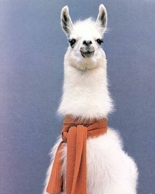
The most important thing that happened this week was the launch of the Exploring Digital Heritage blog. Thankfully it is supported through WordPress which is a blog builder that I had used a few times before in my writing of a llama based journal. Through that I had become familiar with importing images into my text, mostly featuring Llamas (like the one below). img-thingThe blog had been something that had slipped my mind until we brought up WordPress in the unit. I feel like that prior knowledge will help in writing these weekly reflections.

The twitter bots I found fascinating although Twitter is not a medium that I use very often, if at all. However I think these bots are a tool I’d like to explore more at a future date and possibly see how it could be adapted to other uses.


Week 4 Reflection

This weeks class served as a bit of a refresher for me since I’d used a few of the tools such as OpenRefine in a previous unit. The tool Plot.ly reminded me a lot of the graphs I used to make in Microsoft Excel during High school, although admittedly Plot.ly is much more sophisticated and easier to use.

One of the things I have realised through this unit is that I am fairly adept at following instructional walk-throughs, but unfortunately that does not mean that I am able to translate those skills easily into other practical applications.

One of the other things I have realised this week is that I prefer the face-to-face sessions as it keeps me focused. I’ve been having a bit of trouble these past few weeks being self driven, hence the lack of the first two weeks of reflections. This one will be on time though, so that is all I can hope for.

I can’t wait for the next few weeks to expand my knowledge of data manipulation skills. I must admit that finding new tools to use is one of my favourite things about this unit. Hopefully next week shall be just as enlightening!


Hello there

Hiya!

My name is Patience (and unfortunately no I’m not always). I’m the youngest of too many brothers and have a love for Textiles and History. I’ve lived in 3 states and 1 territory but haven’t traveled outside of Australia since I was 4.

I’m currently a part of the unit ‘Exploring Digital Heritage’ at University of Canberra and hope that this class will provide me with some of the skills I need to be able to do more than procrastinate watching videos on YouTube.

At some point I want to work in Textiles conservation but I suspect that aim is a few more years away for me.


css.php