Week 3 Reflection

The first task this week was to do a Google search on the “professional vs. unprofessional hairstyles for work” experiment. Just for fun I then proceeded then tried the search on DuckDuckGo which gives you search results without tracking previous preferences. The DuckDuckGo results were slightly more unbiased than the Google searches although in both the first results when searching “unprofessional hairstyles for work” were articles about the phenomenon and not the original results themselves. At the very least it is always interesting to see how automatically filtered results can affect what you see as your top results.

The most challenging part for this week was exploring how to create GIFs. I’d used image editors before but never for animation, so using it to make GIFs was a new experience. I’ve put in the GIF that I eventually managed to make although the image actually has to be clicked to activate the movement. Over all a fun week this week and taught me new skills I’d never thought I’d have.

19vcs5


Week Four: What Data

This week we looked at the myriad of options concerning data and metadata, where to find it, what to do with it and what it is. I think that the Posner article really set the tone this week for me from doing the reading prior to the class, when he drew an analogy of what you would feel like if someone called your photo album a data set. I though that summarised his article well, illustrating the difference between humanities data and scientific data. Humanities data is most prominently linked intrinsically to people, culture, religion and real lives. This makes context and interpretation even trickier, but more interesting, to deal with, and I think that that was addressed well in acitivites and discussion during the class.

The class really opened up to me how much data there is, not how many records because obviously there’s lots of records of things especially in Western culture, but how many categories of ‘stuff’ is out there. Colonists bank records, water qualities, I even found how a dataset of average fruit intake for an Indigenous Australian primary school student. This class highlighted the importance of digital heritage, in particular in unlocking, fixing, and making sense of historic data to then churn it out in accessible format. What is the point of data otherwise? All of the things we found are super important and interesting to a plethora of people, cultures, organisations and have so many uses whether research, predictive or even personal. As I mentioned before because this is humanities data that stakes are so much higher as they are more actualised in the real world. However there’s no point if data is not in context, can not be categorised, understand or even read properly if there is mistake. The tools we used in the class fixed all these problems, plotly developed visual representations of data to be interacted and understood, openrefine to fix and categorise. Not only did we learn to use these tools, we understood in a broader sense what data is, how it can be used and finally how we can utilised in our own research contexts in cultural heritage.

One thing that I find really interesting was one of the graphs on plotly someone else had made, a pie chart illustrating the most used colours in Van Gogh’s artworks. What a cool use of data as well as graphing to portray something so organically creative and artistic and well non-mathmatical into a tangible piece of data – a good balance between the scientific data and humanities data Posner was discussing.

Here is my graph for male and females in 1901 – silly outlier Adelaide 🙂
 

Who Am I and What Am I Doing Here?

Hello, Hello, Hello,

My name is Amanda; I am a third year Cultural Heritage and Conservation student. Sorry for being a little late to the party. I was originally enrolled in 8945: Museums and the Anthropology of Collecting however since that subject is no longer available I was withdrawn and the email sent to my clutter box, I then had to find another subject instead, jump some late enrolment hurdles and here I am.

In hindsight everything happens for a reason and I am so excited (literally jumping up and down) to be doing this unit. So it was a good thing that my original option is no longer available as now I can learn all the awesome digital ‘things’.

I spend two days on campus working on a research project in the forensics department where I have my own office, which is very cool, and I can get lots of work done. At home I have a little toddler so the peace and quite on campus is great but also leaves me completing my final subjects (including this one) via the flexible option.

I look forward to virtually meeting you all.

Cheers,

Amanda


Week 2 Reflection

Something that stood out for me this week was the introduction of crowd-sourcing platforms, particularly sites like Zooniverse. I’d been exposed to crowd-sourcing sites before, such as Trove but hadn’t realised that the genre had its own name. Learning about the opportunities available through crowd-sourcing has given me something that I feel I could continue do in my down time while still being productive.

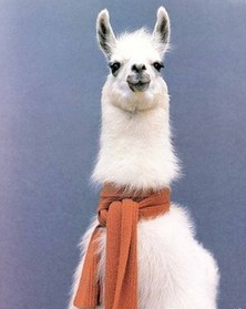
The most important thing that happened this week was the launch of the Exploring Digital Heritage blog. Thankfully it is supported through WordPress which is a blog builder that I had used a few times before in my writing of a llama based journal. Through that I had become familiar with importing images into my text, mostly featuring Llamas (like the one below). img-thingThe blog had been something that had slipped my mind until we brought up WordPress in the unit. I feel like that prior knowledge will help in writing these weekly reflections.

The twitter bots I found fascinating although Twitter is not a medium that I use very often, if at all. However I think these bots are a tool I’d like to explore more at a future date and possibly see how it could be adapted to other uses.


Week 4 Reflection

This weeks class served as a bit of a refresher for me since I’d used a few of the tools such as OpenRefine in a previous unit. The tool Plot.ly reminded me a lot of the graphs I used to make in Microsoft Excel during High school, although admittedly Plot.ly is much more sophisticated and easier to use.

One of the things I have realised through this unit is that I am fairly adept at following instructional walk-throughs, but unfortunately that does not mean that I am able to translate those skills easily into other practical applications.

One of the other things I have realised this week is that I prefer the face-to-face sessions as it keeps me focused. I’ve been having a bit of trouble these past few weeks being self driven, hence the lack of the first two weeks of reflections. This one will be on time though, so that is all I can hope for.

I can’t wait for the next few weeks to expand my knowledge of data manipulation skills. I must admit that finding new tools to use is one of my favourite things about this unit. Hopefully next week shall be just as enlightening!


Week 4 I embedded some charts

Today was a great day. The following is the various graphs I messed with on Plot.ly.

This took some time because I goofed and didn’t select the male and female numbers as the y axis. Got there in the end.

So this tutorial really opened up my mind to what I could do for my project which is really cool because I was a little stuck with that.

I like how you can pull together a whole heap of information without too much effort. This could be really useful not just in the heritage field but also for a couple of my assignments I have coming up, so yay.

I am probably going to do the tutorials on how to use the command line to put data into folders onto my computer like Tim showed us in class. I can immediately see how that would be useful in an assignment, especially as I use trove a LOT for articles.

Katie

Week 3 – Seamfulness and generous interfaces in digital heritage

Hello,

The richly described and evocative concepts introduced and discussed in last weeks readings, further uncovered the possibilities of digital heritage mapping and visualisation.

I liked how Whitelaw saw seamfulness [as]…’an ethical and political stance’: a commitment to exposing interpretive distance. The discussions about transparency, in Sherratt, Sadler and Boug and Whitelaw, and the creation of alternate recourses and experimental platforms, than say, relying on google (yeah, now I can see how limited it is!) also influenced me. The parallels drawn by Sadler and Boug between feminist principles and creating an ethic for digital heritage culture were pointed and realistically grounded, especially how they challenge the notion of the ‘dispassionate’ researcher/archivist.

I’ve come across and greatly admired Ben Ennis Butler’s (and Mitchell Whitelaw) work on the Australian Print Collection ( link through NGA website) – it’s contemporary, local and relevant (for me )and it helped contextualise how collections can be accessed and presented in an inspiring and generous way.

The animated GIF’s were great and I’ll give it a go over the coming days,

Anna

Week 3 – Bits and Pieces

Hello.
I have to say, I like to tweet. I am naturally verbose, but I like the challenge of highlighting something or making a point in a limited number of words. Blogging feels strange, like talking to no-one or to myself…
Aiden, thanks for pointing out Mitchell Whitelaw’s Ted talk. I was lucky enough to attend a symposium at Canberra University a couple of years ago where Whitelaw spoke about “Generous Interfaces” vs empty search boxes. It transformed my thinking. Following the symposium, I was tasked with overseeing a project at the NMA that resulted in Collection Explorer (http://collectionsearch.nma.gov.au/) developed by a Canberra based web company Oxide Interactive (http://www.oxideinteractive.com.au).
I believe Collection Explorer includes many of Whitelaw’s concepts – inviting users in object type, place and even by material. Like Trove, Collection Explorer exemplifies a platform which continues to be a work in progress as NMA collections continue to be digitised. Also new ways to interact and traverse the collection are developed as time and money allows.
In terms of other great generous heritage interface my favourite continues to be the Rijksmuseum (https://www.rijksmuseum.nl/en/rijksstudio). Not only does this site entice you to explore, but much of the material offered is out of copyright and reuse is encouraged!
Regarding Google Algorithms and Filter Bubbles – it’s frightening to consider how our thoughts, actions and lives are being unconsciously directed and shaped without our consent. Masses of Information is added to the web on a daily basis, and with this ever increasing volume it’s difficult to see how in the future we’ll be able to navigate through the jungle/web to acquire a balanced diet of “vegetables and Desert”!

Week 3 – Thoughts on searching.

Hi,

After reading Mitchell Whitelaw’s paper, it felt vaguely familiar. Then I remembered that I had seen his Tedx talk from 2010, in which Whitelaw explains the power of visualisation for digital collections. Whitelaw does an amazing job of conveying all the amazing aspects of these visualisations, and also being excited about the possibilities.

I certainly agree with Whitelaw, although Search engines have their strengths, they’re not the best way to show off a collection to someone who isn’t familiar. Funnily enough, my favourite examples of these visualisations, that Whitelaw is talking about, are the tactile displays at the NAA and the National Arboretum. If you haven’t had the chance to seem them, they’re both worth checking out.

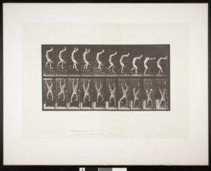
I would write more here but i need to go watch a GIMP tutorial so I can make a prize winning gif. My goal is to make this image of an acrobat from the USC Libraries loop, so he can walk on his hands forever.

Handstand0

Cya Wednesday

Aiden


A couple of thoughts for Week 3

1. When searching a particular phrase the results that are returned should reflect an actual answer to what you are asking for not just the current bias.
2. http://pmem.unix.fas.harvard.edu:8080/peabody/browse I particularly like the selection process on the Peabody Museum in Boston with the groups of commonly requested items. They give you a visual guide to the objects others have previously been engaged by.
3. Using a set of my favourite song lyrics from Florence and the Machine, the hippo ate words such as love, father, kisses, children, turning, happiness etc. This returned a result of census records and photos from Trove, the Natural History Museum in London. Naturalis Biodiversity Center on Europeana, La Foruna Visiva di Pompei on Europeana. Im not a hundred percent certain what the point of this particular exercise was meant to achieve.

css.php