The most impressive thing I learnt this week is using carto to create interactive info maps. So, thee following links are maps about cyclist crashes in Canberra.
https://kinglosh.carto.com/viz/d5baf012-7fb4-11e6-a927-0e233c30368f/public_map
I think it’s very useful for journalist to create online interactive info map, not just text, or a solid image. It’s available for both desktop and mobile. And you can add more other elements to it, like tittle, image. However, I found that there is a disadvantage for this tool, you can’t use mouse wheel to zoom the map, and I can’t find how to turn on it, so maybe it’s a design disadvantage.
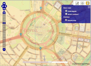
This image is the capital hill that I created by Map Warper, it’s not 100% accurate. Maybe it was caused by my careless, or caused by the maps themselves. It’s not very complex to do it, even you can do it in photoshop, but I guess the exist of the website is provide a platform for people to share and communicate, even you can play with other people’s map.
This is the map that I created in Google My Maps.
https://drive.google.com/open?id=1CMrOnbyBLUEXyQs-EHMqUmGtHUU&usp=sharing
https://www.google.com/maps/d/viewer?mid=1BuM2waJ91XS8dw4inq-MSOHR0lE&usp=sharing
For the Canberra bus stops, just like Tim state in the handbook, Google only support 2000 points in the map, so those bus stops in Gungahlin were missing. But I don’t know why it’s Gungahlin, not Belconnen, City, Woden. I think Google should resolve this issue, otherwise it will be very inconveniente. And people can’t use this tool to create more useful maps like this.
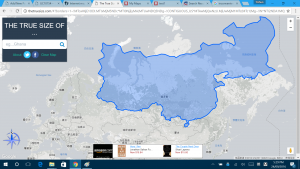
This is the land size comparison of China and Russia. (My operating system is in English, and Chrome is also in English, but I don’t know why it still shows Chinese, LOL.) So we can see, Russia is not so big as we imagine, though it’s bigger than China.

