Hi everyone!
Another long one so I’m going to pup it beneath the cut!
Enjoy!
This week we looked at data visualisation and some of the tools available that can be used in a digital heritage context.
Plot.ly isn’t my favourite website to use for creating graphs (I really don’t like signing up to websites I’m not going to use) but it was used again today to create a stacked and group bar chart on attendance at cultural institutions by gender (2013-14).
I enjoyed looking at already established digital heritage projects more than creating graphs. It’s possible to make really powerful and moving projects through the visualisation of data. Two sites that do this really well are Invisible Australia’s The Real Face of White Australia page and Mapping Police Violence. Both pages bring a human aspect to the issues of race in Australia and the United States. The Real Face of White Australia’s strength comes from allowing visitors to the sites to view pictures and profiles of the people who were directly affected by the White Australia Policy. Similarly, Mapping Police Violence also allows you to view profiles of the victims of systematic fatal police shootings in the US. The page is aided by a visual timeline of a map of the US that ‘lights up’ when an incident occurs. This is also aided further by graphs, charts, and other visualisations of data.
One of the highlights of this lesson was looking at Mapping the Republic of Letters where I learnt that Voltaire sent out more letters than he received (probably angry letters) and Kindred Britain where I discovered that David Cameron is slightly inbred (yikes!).
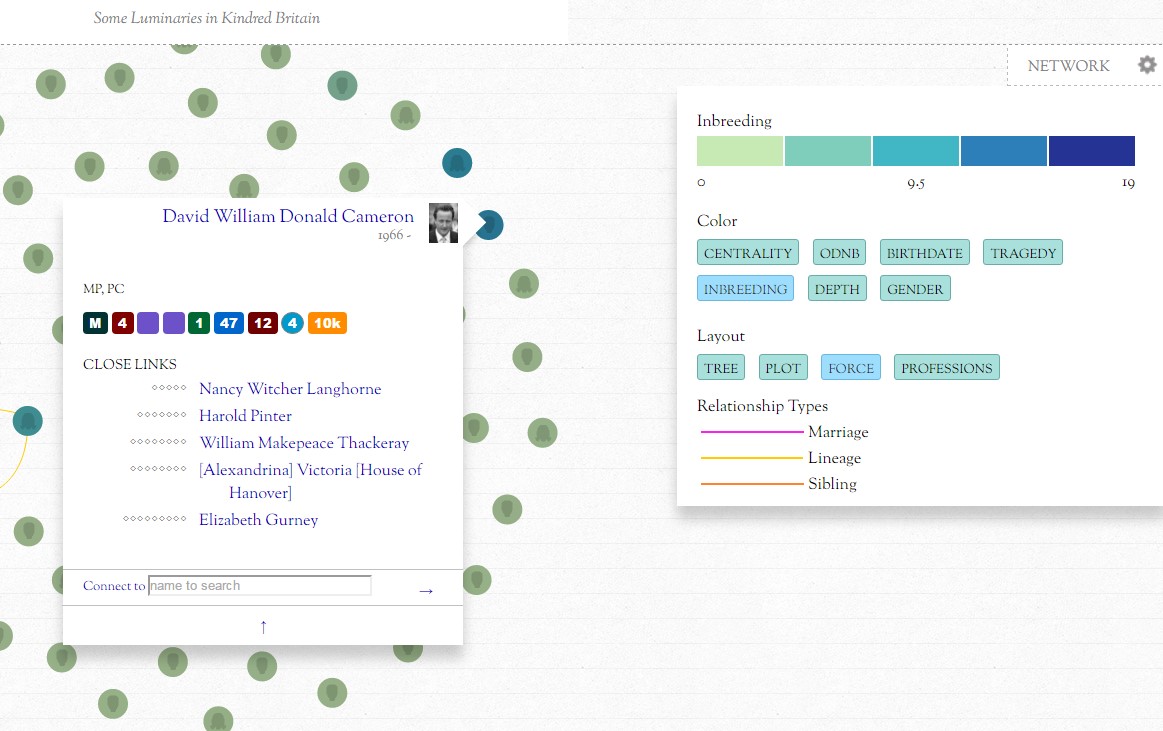
It’s important recognise what a graph does and doesn’t show in order to get the full story as visualisations don’t always have the capability to show everything (what kind of letters was Voltaire sending??!?).
Until next time!
Jacinta?