Good Afternoon,
Here we go, Data visualisation. Whilst working though the various visualisations this week, I was thinking about how I could use these in terms of the proposal due very soon, and I think many of these will be quite useful. For my project, I’m thinking of using AIATSIS and AUSTLANG data on indigenous languages of Australia. I’ve seen plenty of language maps, such as this, and I’m trying to figure out what I can bring to the table. All I can say is that most of the visualisations i have seen have been static, perhaps I can create a more interactive version of the map I’ve just linked? But what would that look like? Let me know if this has been done and I just haven’t done my research.
Anyways, here’s proof that I did stuff for week 6.
Internet Access by Age – Pie Chart & Column Chart
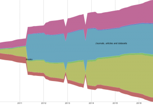
Trove Work Counts 2010-2016 – Plot.ly Stacked Bar Graph
Trove Closed Links – Fusion Table
When I was testing out the physics of the fusion table (which is mesmerising) I shook one of the major points, and a triplet of point shot out from the rest, showing that those three closing reasons were only ever used with each other. That’s something I probably wouldn’t have noticed had the chart been static, let alone from the raw data.
Alright, better get on to the proposal.
Cya!
