Week 2: Doing it in Public

Sorry for this very random and out of place blog post regarding Week 2. I was worried that I did not have 8 posts so thought I would write about this week’s topic as well because it was one that really stood out for me so I was surprised I had not reflected on it ! (Who knows what I was doing instead!) 

Heritage, museums, and digital heritage to me is all about the public, there would be none of it without an audience. Trove Traces really highlighted this, that whilst everything might be about the audience and the public – we have really no control of how they may engage with digital data/representations, how they will feel about it or take away from it. It is completely unexpected, and therefore makes the digital world constantly changeable and different to every person that works through it. I saw this in the class as well with how different people reacted to things differently, and the different types of projects we all came up with.

I really loved the crowdsourcing projects, and will admit I spent quite a well on the Measuring the ANZAC’s at home. I liked it because it wasn’t an assignment, there was no pressure for me to do however many however fast. It was so interesting to actually engage with the documents and make a small difference in their research and context. It lets you be apart of the history, and shows how much work there is to constantly do in this field!
Lucy’s Digital Project Reflection

My digital project, Endangered History Story Map, highlights through a visual moving map the heritage sites from different countries that have been destroyed/substantially damaged by war, civil unrest and terrorism in the 21st century. This is to simultaneously provide an outlet to remember and gain information about these sites as well as raise awareness about the forces that threaten our international history and identity.

Continue reading “Lucy’s Digital Project Reflection”

Week 13: Reflection Reflection

This week we reflected on the whole semester, and as we covered a lot of ground it offers a good insight into the more generalised questions of digital humanities. What is it for? What does it change? As well as the morals and ethics.

I think Tim highlighted a great point with his Australian Policy piece, that digital humanities is about making difference, about taking what we already are doing with data from history and heritage, and churning it through new perspective. The internet is not set, we can change and play with it, just like history, and it’s our moral duty to change it in a way that can better be accessed and engaged with whilst not silencing anyone’s stories. To me that’s what the unit has been about, using these tools in a way to better an existing data set so that stories can be told and seen and shown.

I particularly liked Miriam Posner’s reading, in particular to the critical tone she set in identifying the limits of digital humanities so far, and in that recognising how much more we can do! In particular things like how maps are set by one person or rule, and how interesting would it be that google maps or the like used Indigenous maps? Questions like this, the what if as identified in class is a huge driver of this study, and to look at the digital tools critically – not just taking them as they are and changing them ourselves – and to realise the potential Thomas Padilla is talking about is to not just use the digital world but to master it.

Week 10: Virtual Realities

I love the potential for 3D imaging (and printing) and am so glad it has been discussed in this class because not only is it weirdly cool and futuristic, it has so much use in the heritage field. I actually really like th example of when a historicaly significant arch had been destroyed in Palmyra by Islamic state, 3d imaging from UNESCO was used by the Institute of Digital Archaelogy to create a 3D print of the arch using Egyptian marble and now stands in Trafalgar Square. Not only is this letting a new audience interact with something that may not have otherwise (also good like Tim suggested from educational purposes for remote towns but also good for potentially dangerous countries that have a wealth of historical objects many can’t access) it’s also saving that object as well. Touching and seeing an objects physicality is a primary component of engaging with, understanding and enjoying an objects, and gains context to its history. Recently I visited the 100 objects of the world at the National Museum, and one of the objects is the original wood cut of Durer’s Rhinoceros. Next to the originial the National Museum has a hologram of the rhinoceros and a link to a 3D printable from their website. These are there to represent the inaccuracies in the drawing (as it is considered a non-accurate drawing of a rhinoceros that was taken as fact by the British) as well as a good educational tool.

I do agree that we don’t want to get too caught up in augmented or virtual realities, as it takes away the realness of seeing objects (we’ve all seen the Mona Lisa before, but how many have really seen it is different.) However I think that in terms of accessibility it is a great digital strength, those who may not have money, physical ability, or live too far away can experience museums that they may have interest in personally or academically. In regards to specific museum’s purposes this may match many criteria of letting the public experience history and sharing that.

Here is an example of my own 3D image using 123d catch, I have a humble collection of Buddhas so here is on

Week 11: Archiving the web

This is something that really has not occured to me before but really should have. Archiving the web has so many purposes, and offers such a great insight into the technology, opinions and social practises in contemporary history. In particular WebRecorder is an interesting tool for personal curating of your own experience with the web, and takes control of both literal history and the way we engage with it. No non-digital tool could simultaneously use the technology it is trying to archive and show its capacity. Storify is an example of collecting reactions/thoughts that I think has a lot of potential. Obviously twitter already has the ‘search’ tags, which similarly does what Storify does, but Storify allows you to curate, and present it in a tangible and analytical way. I made my own on the reactions of twitter promoting the Smithsonian’s kickstarter project to help raise funds to preserve Dorothy’s ruby slippers from the Wizard of OZ:

I always think in terms of collecting and objects, what can this tell people 100 years from now and does it matter? In this time the internet would be a hugely significant thing in communicating to people from the future studying history of today of what society was like. I think capturing not only websites and their history, but it’s also a new way of capturing people’s beliefs and opinions on social media which is really cool.

Week Nine: Face It

A trend has begun within these classes moving towards this class today I think. Ways in which we can utilise cultural heritage data to make it more engaging, and accessible using digital tools – and today really empathised that with the use of computer vision technology. We have looked at neatening data, making it into a variety of visual graphs and so forth. This week was all about images, and how to help computers see images in ways that are more useful and tangible for us (and sometimes accidental like Redaction ‘Art’). The most visceral and moving example was the images of the faces of people under the White Australian Policy. I think this is a beautiful way of fleshing out an issue that is widely known, but more in a way of dates and laws, rather than the actual who. Visual aids appeal to our humanity because a face is so recognisable and emotive, it instantly builds empathy because this is another person just like you or me.

Tim was discussing that the goal for another example, the Trovebot, putting faces on people who sent in photos was to try and connect people to the past in new ways. I love this as it continues to makes this data significant, because without interaction its meaning is lost. Face detection technology is a lot of fun too and I can see how this can be used in a variety of different ways, perhaps even at cultural institution with a photo booth like set up putting images of faces from the museum on to your own.

The face detection subject just reminded me a lot of the Snapchat filters that are popular, and sometimes they do have historically relevant ones (such as Marilyn Monroe on her birthday or the faceswap option where you can upload and image to swap with your own which I have seen is quite popular to do at classical art galleries). This is engaging, shareable and fun and this is another outlet that is potentially significant for cultural heritage as it is very good and well known technology.

Facial recognition on the other hand, a little creepy, but without obvious benefits used by the right people. Being able to identify historical figures in object would be great for example.

Week 6 Visualising Data

In previous weeks we have looked at data in numerical or even alphabetical form, and I think we got a lot out of that information such as trends as well as what data is out there, where and how to get it. However a lot of data is very boring to look at and very long. This means, in particular for humanities data it looses a lot of its feeling and understanding. This week we looked at tools that can take in data and then churn it out in one of the visualisations, and how much customisation we can do like in Plotly and Raw. Examples like Mapping Police Violence and The Preservation of Favoured traces utilise movement and colour to very effectively and viscerally portray data. Mapping Police Violence had data points pop up like gun shots, and the rate at the changes of The Origin of the Species physically showed the theme of the progress of science. I thought these were really fascinating examples and summed up what we were trying to identify and explore in the class. Although I am more interested in mapping for my project I gained from the class that some visualisations match some data better, which can help me in selecting visual components for my project.


Here is my stacked bar graph using plotly rather than QueryPic


Week Five

This class was very interesting to me, especially as I am taking literature as a major. What words we use and how we use them are vital in any field of study, as the communication of information, feelings and history is a salient part of humanity and society. Quantifying them into a manageable state or data set makes it easier to pick apart, reflect and study them was the purpose of this weeks class. It’s cool how you can start off with a question like when did we start saying World War I, or you don’t have to have a question at all and finding answers with in what you’re given is also a way of using the data. For example it was interesting in a sample from  SameDif the comparison between Hilary Cliton’s speeches and Donald Trump’s. It showed what words they both used, and what words each only used with no cross overs. Clinton hadn’t used Mexico once, whereas it was one of Trump’s most used words. These programs offer such a simple way of finding windows into history by seeing how we write and talk about the world around us.

Week Four: What Data

This week we looked at the myriad of options concerning data and metadata, where to find it, what to do with it and what it is. I think that the Posner article really set the tone this week for me from doing the reading prior to the class, when he drew an analogy of what you would feel like if someone called your photo album a data set. I though that summarised his article well, illustrating the difference between humanities data and scientific data. Humanities data is most prominently linked intrinsically to people, culture, religion and real lives. This makes context and interpretation even trickier, but more interesting, to deal with, and I think that that was addressed well in acitivites and discussion during the class.

The class really opened up to me how much data there is, not how many records because obviously there’s lots of records of things especially in Western culture, but how many categories of ‘stuff’ is out there. Colonists bank records, water qualities, I even found how a dataset of average fruit intake for an Indigenous Australian primary school student. This class highlighted the importance of digital heritage, in particular in unlocking, fixing, and making sense of historic data to then churn it out in accessible format. What is the point of data otherwise? All of the things we found are super important and interesting to a plethora of people, cultures, organisations and have so many uses whether research, predictive or even personal. As I mentioned before because this is humanities data that stakes are so much higher as they are more actualised in the real world. However there’s no point if data is not in context, can not be categorised, understand or even read properly if there is mistake. The tools we used in the class fixed all these problems, plotly developed visual representations of data to be interacted and understood, openrefine to fix and categorise. Not only did we learn to use these tools, we understood in a broader sense what data is, how it can be used and finally how we can utilised in our own research contexts in cultural heritage.

One thing that I find really interesting was one of the graphs on plotly someone else had made, a pie chart illustrating the most used colours in Van Gogh’s artworks. What a cool use of data as well as graphing to portray something so organically creative and artistic and well non-mathmatical into a tangible piece of data – a good balance between the scientific data and humanities data Posner was discussing.

Here is my graph for male and females in 1901 – silly outlier Adelaide 🙂


Introducing you to Lucy ?

Hello there,

I’m Lucy and I’m studying the Bachelor of Museums, Conservation and Heritage at the UC, with a particular interest in the Heritage and Museum majors. I’m an original Canberra girl and currently work as a receptionist. I’ve just finished my Interior Design certificate as well so love surrounding myself with all types of pretty things! I’ve also worked as a feature writer for a Canberra based arts publication Big Ink and have done some volunteering for CMAG.

I was primarily drawn to the degree as I love telling stories, finding new stories, and sharing them around – I originally wanted to be a writer! However I think that this is really what history is about, and finding stories that have been unheard of and making it accessible to anyone is really powerful and I think an amazing job (and purpose) to have. So I had a change of heart and leapt into heritage studies and never looked back. I’m super excited for this unit and can’t wait to learn how I can be more active in some of the really cool changes that are happening in how we engage with, examine and share our history through the new technologies of our own history. Having already completed the Museum and Collection Managment unit in 2015, also run by Tim, I have a feel for a couple of the things we might be doing but know I have a lot to go :0

Apart from studying you can find me at the gym, going on adventures with my partner, or feeding my addiction; movies. My Dad works at the National Film and Sound Archive so my love of stories, movies, history and museums runs in the family!

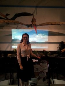
Here I am at my most recent museum visit, The Dinosaur Museum 🙂 14012366_1319979831365237_1517757627_o

css.php