Project Reflection

Project Summary

The ‘Tiananmen Massacre Timeline’ project have two parts: the timeline created by TimelineJS, the online discussion group. The timeline is intend to give people a clear and comprehensive view of Tiananmen Massacre in 1989, and inspire target audiences (Public, Journalists and Media, Researchers and Students). People can click the dots on the timeline, or click the direction button to view the text, images, videos, tweets on each page. The timeline will be updated by myself regularly, add, delete, modify. Another part, the online discussion group is intend to give people a platform to share more things about Tiananmen Massacre. As the owner of the group, I will also post things about Tiananmen Massacre regularly.

What I learned

To be honest, making a timeline is a ‘hard work’ rather than other kinds full of skills, making people feel ‘magic’. You just need to put date, tittle, text, media, credit into spread sheet and go to TimelineJS to generate the timeline. Then I created a Google group to give people a place to discuss, share anything about Tiananmen massacre. I don’t feel hard to use these tools, they are very easy to use. So what I learned is:

The ability to collect and select relevant materials and information. When I was doing the timeline, I visited lots of resources, including Trove, CNN, BBC, Soundcloud, Twitter, YouTube and others. Some of them are good, very relevant to the timeline theme, some are not good enough, or not reliable enough.

The ability to telling the story logically by using these materials. Another important task for creating a timeline is telling the story logically, especially for people who don’t know about that. In fact, before I start making the timeline and collect materials, I don’t have a clear image about 64 Tiananmen in my mind, I just know lots of people were killed, the tank man, I even don’t know why it start. In my timeline, I have introduced Hu Yaobang’s death is the fuse of student protest, then, the students and government’s conflict became the massacre. I can’t say my timeline has properly tell the story, and logically, however, if people have any doubt they can visit the Google group I created for people to discuss, and provide me any advice.

In fact, many videos voiceover are Chinese, one reason is it’s difficult to find same or similar material in English, another reason is part of  the timeline audience are speaking Chinese. So for non-Chinese speakers they can’t fully understand the content, but with the pages before and after, I think they can roughly understand them.

Assessment

As I said in ‘what I learned’, an important thing for timeline is telling the story clearly, logically. I think my project has meet this aim, but there still many shortcomings in my storytelling, like the transaction are not very clear, too many media but I’m not sure whether they can tell story clearly.

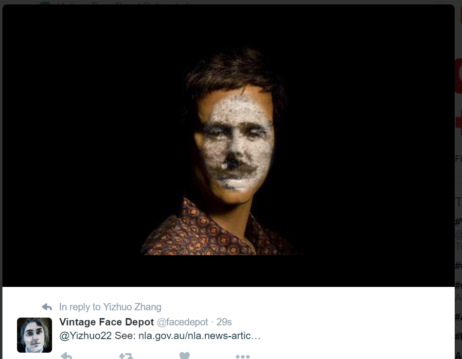
I have switch to Google group to let people discuss rather than a website created by Wix. The reason is, one of my aim for this project is give people a platform to discuss and interactive, share, and make the timeline become better. Just creating a website can’t realize it, or it’s hard for me to realize it. However, creating a Google group can easily achieve this goal, people can share, discuss, and help build the timeline. I have put a shared link of the spreadsheet I use for the timeline, it’s in view mode, people need to make a copy. However, it’s not compulsory for them. There still no other people come to this group yet, but I think it’s a good demonstration for my aim.

How the project might be extended

My project is a demonstration to show the Chinese modern times democracy movement. Some people may care about the impact of Tiananmen Massacre, and other Chinese democracy movement, like The Umbrella Movement in Hong Kong, Sunflower Movement in Taiwan, they are similar like Tiananmen protest, initiated by the student, asking for democracy from Chinese central government. There are no people dead in that two movement, but still worth commemorate, and they are still continue.

So the project can be extended to show these two democracy movement in Hong Kong and Taiwan, and other democracy movement or human rights movement in China. For example, from June 2015, many lawyers who protect people’s rights were arrested by Chinese government, they claim didn’t do anything wrong, though Chinese government said those lawyers doing their job in illegal way. So this also can be presented in a timeline.

Or, I’m good at making videos, so I can making videos to present these kinds of movement.

And as the aims of my project, let people share, discuss, help build the project, it can be the extension.

I can also use other storytelling tools to told the story. Like storify, I learned it from ‘Digital Media Literacy’. And to be honest, I think TimelineJS is not good enough, it can’t show the image included in the Tweeter, and it can’t automatically extract information from the web page, however, Storify can do it. So I can use Storify to telling the story as well.

Week 10 Reflection_Yizhuo Zhang u3125186

For a long time, the way of museums, galleries, and famous interests displaying their digital content are doesn’t changed, no matter online or on site. As far as I know, in some museums in China, you can rent a tool that allows visitor enter a code near the item, and listen the audio guide content. It’s a good idea, and many museums are doing that, but if we take further, the visitors can rent a VR equipment, their visiting experience will have a big changed! They can watch VR/AR content about the item, or a theme.
However, there’re still some problems for doing this.
It’s still very expensive for some museums to afford VR equipment, not to mention creating the VR content for their items. For content production, I think they can hire university students to help them, or let the contractor do this. For the money doing this, it can be a crowed funding program, donate to this, benefit from this. Or ask their government. Or maybe the ‘United Nations Educational, Scientific and Cultural Organization’ can start a foundation for museum collections and interests digitize, especially for VR content.
To make museum collections become more easy to be watch, why not put them on XBOX, PS4? It can be a game, or just an app, with game handle, people can freely explore the collections, even they don’t have VR equipment.
As a result, anytime, anywhere, people can easily access the collections VR content, or just digitized content. It can be global fund, global share.
BUT, let’s go back to money. This kind of VR/AR are usually free to view, let people to pay them just like pay the ticket to visit the museum or gallery? YES, it’s a good idea, but the content should be extremely good quality, otherwise people won’t pay it.Or, let the commercial ads enter the VR world? Not bad, I believe most people don’t like ads, but if it can make the VR be substantial, why not do that? But I think the ads should be relevant to the content they are viewing, and we already have this kind of technology.

Week 9 Reflection_Yizhuo Zhang u3125186

This is the face replacement with @facedepot.

untitled

It’s quite interesting and useful. This belongs to face detection, not recognition. Actually, face detection has already used for entertainment use, like Snapchat, you can create interesting video with interesting face in real time.

kim-kardashian-snapchat

I’ve tried the Face++, it can not only detect human face, but also tells you the gender, age, races, and other information.

untitled

I think it can be used for department shopping industry, when people want to try some clothes, they just need to standing in front of camera, or upload their photo online. Then, according to their gender, age, races, body size… the system can give suggestions to them. However, it can also raise racism and gender equal problems. Nobody can say Asian people can’t wear what kind of clothes, or can. Nobody can say female can’t wear what kind of clothes, or can.

And for those hair styles that can blind facial recognition system, I don’t think it’s a big issue. Because with the development of technology, more advanced system will appear, and it won’t blind facial recognition system any more.

However, just like many people may think, the Aussie government’s new ‘weapon’ may raise privacy problems. So, I fully support government’s behaviour, but they need to make sure people’s privacy can be fully protected, only used for government departments. Not sold, not leaked, not like census.

20150508024015208

And yes, facial recognition can be very helpful for heritage protection, instead of human eyes. Maybe you can find Emperor Qin Shihuang was walking in crowd at a ancient China painting?

For the last video at week 9 handbook, I think it can raise fraud issues. It looks like Snapchat, but if some people believed it, maybe someone use granddaughter’s face to fake grandmother of grandfather. And it’s not only photo, it’s video, with the voice can also be imitated with latest technology.

untitled-2

I have tried IBM demo page, and the result is right.

Week 7 Reflection_Yizhuo Zhang u3125186

The most impressive thing I learnt this week is using carto to create interactive info maps. So, thee following links are maps about cyclist crashes in Canberra.

https://kinglosh.carto.com/viz/d5baf012-7fb4-11e6-a927-0e233c30368f/public_map

I think it’s very useful for journalist to create online interactive info map, not just text, or a solid image. It’s available for both desktop and mobile. And you can add more other elements to it, like tittle, image. However, I found that there is a disadvantage for this tool, you can’t use mouse wheel to zoom the map, and I can’t find how to turn on it, so maybe it’s a design disadvantage.

capital-hill

This image is the capital hill that I created by Map Warper, it’s not 100% accurate. Maybe it was caused by my careless, or caused by the maps themselves. It’s not very complex to do it, even you can do it in photoshop, but I guess the exist of the website is provide a platform for people to share and communicate, even you can play with other people’s map.

This is the map that I created in Google My Maps.

https://drive.google.com/open?id=1CMrOnbyBLUEXyQs-EHMqUmGtHUU&usp=sharing

https://www.google.com/maps/d/viewer?mid=1BuM2waJ91XS8dw4inq-MSOHR0lE&usp=sharing

For the Canberra bus stops, just like Tim state in the handbook, Google only support 2000 points in the map, so those bus stops in Gungahlin were missing. But I don’t know why it’s Gungahlin, not Belconnen, City, Woden. I think Google should resolve this issue, otherwise it will be very inconveniente. And people can’t use this tool to create more useful maps like this.

china-and-russia

This is the land size comparison of China and Russia. (My operating system is in English, and Chrome is also in English, but I don’t know why it still shows Chinese, LOL.) So we can see, Russia is not so big as we imagine, though it’s bigger than China.


Week 6 Reflection_Yizhuo Zhang u3125186

This week we have covered the data visualization. We can see visualized data anywhere in our life, like text book, newspaper, TV, or even on the menu. And Google Analytic also provide a good way for webmasters to view data visualized. I have studied ‘Networked Media Production’ in last semester, so I know how to use it.
.The 6 examples given is very good. Especially the ‘Mapping Police Violence’, it’s not only visualized, but also interactive. It can be used for data journalism. ‘A timeline of Earth’s average temperature’ is good, but not interactive, so probably it’s better for education use. But it can be transformed to interactive, because I think people would like to ‘explore’ rather than be ‘feed’.
For the bar chart I created in Plotly, I think group mode is more effective. Because it can ‘compare’ which is more, even slightly differences. But we can’t see small differences under stack mode.
I think ‘Dataviz Catalogue’ is great tool for me to find suit online tool for data visualization, very quickly and comparable.
‘Charted’ is super easy to use, but however, just as mentioned in the handbook, it’s customized option is very limited! I don’t think ‘less is more’ applied in here, because people will finally abandon products with less functions, and use similar one with more and better functions. Just like iOS, it’s simple, but it’s also constantly add more functions and improvements.
And I have completed the challenge.

media-20160916

Week 5 Reflection_Yizhuo Zhang u3125186

In this week, I explored how to analyse text with variety of tools.

When I looking at the Newspaper articles of The Great War vs First World War & World War I, I found in 1916 there are a few data about World War I. But logically, people won’t call it as ‘World War I’ before WW2 occurs. As the reason presented in course handbook, that’s due to users tagged ‘World War I’ when they viewing other articles.

But, I think it shouldn’t happened, when making QueryPic, users tags should be ignored, or other methods to exclude them to enhance the accuracy.

When I using Google Ngram Viewer tool to compare ‘China,Japan,America’ in English, and ‘China,Japan,USA’ in English as well, I found the ‘USA’ comes up very late, just until 1940s, but the ‘America’ are always very high. Does ‘USA’ just founded in 1940s? Definitely not. I’ll explore it further.

I found ‘wordcounter’ www.databasic.io is quite useful to present the ‘most’ and ‘least’. Especially for journalist, they love to write what the politician says most often. And when I analyse journal articles, speeches, it’s also quite useful. I think I will use it for my project, as it can count what people said most, I can analyse the situation at that moment (Tian’anmen massacre).

SameDiff is also very interesting, it’s a tool that can help compare text. Yeah, it’s also useful for journalist.

http://voyant-tools.org/ can create the ‘cloud’, actually this kind of tool has also appeared in some social media. In Sina Weibo, users can use a plug-in to create their unique image, usually some words that they use most often in their post.

http://voyant-tools.org/ and SameDiff can also customise exclude certain words that you don’t want (or you only want) to be counted. It can give user a more clear vision.

Week 4 Reflection_Yizhuo Zhang u3125186

In week 4, I explored how to deal with data.

I understand how to use Plot.ly to creating a chart to presenting data. It’s quite easy to use, just like Excel, and I can share the chart online. But I found a problem, that is, when we use bar chart to visualise the SA census data, the Adelaide is too high, so we just delete Adelaide in the chart, but I think it’s not the best solution. Or maybe we shouldn’t use bar chart. I’m still seeking the solution to deal with similar situation.

I’m considering to use Plot.ly and other tool to make a project about history event, Tian’anmen 1989.

Then I explored some states government data website, I found some interesting data, like vineyards census in SA, Cattle tick zones in QLD, VicRoads Turning Movement Volume Surveys in VIC.

They are really convenient to access. But in China it is impossible, data is the secret of government, they rarely publish useful data, even people don’t think those can defined as “secret”. And for my project, I think I can’t find useful data from Chinese government website, because the topic is too sensitive.

I also found WTHCSV is quite interesting, you can see the “most” of a set of data. Like the most family name in SA. I will consider to use this in my project.

I think import.io is also very useful, it makes me away from heavy work. The most useful point is you can use it to extract a list from web, like parliament MP list.

I’m sorry I can’t use API to deal with data, but maybe I will be more skilled in the future.

Cheers,

Yizhuo Zhang

Week 3 Reflection_u3125186 Yizhuo Zhang

For the filter bubble showed in this week’s tute, to summarize, it’s just what you tell the tool and the tool back to you. I have talk about it in week 2’s reflection, a Microsoft tweeter bot.

I have learned the unit ‘Communication Evolution’ in last semester, it also tells us how filter bubble works. It will back to you the search results depend on what you searched before. It depends on people’s living habit, religion, work place and more.

One of the article in this week’s handbook says this feature could limit people’s horizon.

That’s true, but not always true.

Filter bubble can optimize people’s experience. People won’t expect to get the result about ‘University of Canberra’ if they live in California, and don’t want to see the good news about Donald Trump if they support Democratic Party.

I’ve heard a news about Facebook, it says the Facebook is more likely to show good news about Democratic Party rather than Republican. This status could be the result of people’s searching, Barack Obama is very popular on Facebook since he starts election. Or some people says that’s the result of Facebook and financial group’s control.


I’ve read the article’s about bias in collection research in the handbook. Perhaps it just like what we get from search engine. I’m interested to do my project about this, but I don’t know how to start.


Serendipity is very cool. It just shows me the results of some key words input, and you can expect magic happened. Some results are very interesting. The difference between Serendip-o-matic and Google is, Serendip-o-matic give you the results just from the collections, but Google gives you the results from the whole Internet. You can see the ‘past’ in Serendip-o-matic, and see the ‘now’ through Google.


For the Copyright issue in week 3 workshop, I think it’s indeed a problem. What we can do is just work hard in current condition, and try our best to get good results. It also apply to other problems we may face in heritage research.

Week 2 Reflection_Yizhuo Zhang u3125186

Week 2’s class is a great experience, I want to talk about crowed sourcing first.
I’ve got lots of fun on crowed sourcing, I have helped recognize handwriting words or words printed, draw a frame on animals’ faces, recognize plants and contribute info.
However, I’ve got a question about crowed sourcing website like Zooniverse, if someone contribute wrong information, how does it will be corrected? Or, if a person or a group of people deliberately contribute wrong information, how to avoid that? Maybe the system will select a “average” answer to one item, but if most of them are wrong, how to do it?
So I think the best solution is Webmaster or experts read them, and revise it.
Or maybe like the Wikipedia, everyone can see other people’s change, and revise them.
So I think crowed sourcing is a good method for digital heritage reservation, but it still need to be improved. And the most accurate way is do these things by experts or person who reliable.
The bots on Twitter are very interesting as well. I have heard bots on Twitter before, and also on China’s edition Twitter Weibo. It’s very conviniente for people to find what they want to know, and also very important for digital heritage research.
But, something I’m concerning as well, that is, people may teach bots bad things. ie, Microsoft has launched a bot on Twitter several months ago, but people find it start to reply bad words, then, Microsoft found the reason is many people tell bad words to the bot, and the bot learnt them.
So I think it’s one of the point we need to be careful in bots for digital heritage research.

Introduction of myself

Hi everyone,

Nice to meet you guys in class. I’m Yizhuo Zhang, a second year student, and I’m currently studying Bachelor of Media Arts and Production, which is more like film production.

The reason I study this unit is, This is for my open elective unit. I think it will be very interesting and lots of fun. I like historical things, and I have some skills for this unit, like website building, video production.

Hope we’ll have a great journey for this unit!

css.php