This week we have covered the data visualization. We can see visualized data anywhere in our life, like text book, newspaper, TV, or even on the menu. And Google Analytic also provide a good way for webmasters to view data visualized. I have studied ‘Networked Media Production’ in last semester, so I know how to use it.
.The 6 examples given is very good. Especially the ‘Mapping Police Violence’, it’s not only visualized, but also interactive. It can be used for data journalism. ‘A timeline of Earth’s average temperature’ is good, but not interactive, so probably it’s better for education use. But it can be transformed to interactive, because I think people would like to ‘explore’ rather than be ‘feed’.
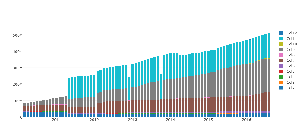
For the bar chart I created in Plotly, I think group mode is more effective. Because it can ‘compare’ which is more, even slightly differences. But we can’t see small differences under stack mode.
I think ‘Dataviz Catalogue’ is great tool for me to find suit online tool for data visualization, very quickly and comparable.
‘Charted’ is super easy to use, but however, just as mentioned in the handbook, it’s customized option is very limited! I don’t think ‘less is more’ applied in here, because people will finally abandon products with less functions, and use similar one with more and better functions. Just like iOS, it’s simple, but it’s also constantly add more functions and improvements.
And I have completed the challenge.