Week 6 – Reflection


Data Visualisation or Statistical Analysis?

Data visualisation or statistical analysis? It is a bit of both really isn’t it and I can’t say I was fond of statistical analysis in first year. Although info graphs appeal to me very much. They tell a much better story then a plan ol’ graph.

Data visualisation all seems very subjected to me, what appeals and represents information to one person is completely confusing to another, especially when you start to employ colours. I like pink and purples and my attention will be grabbed immediately when using these colours. Browns and greens not so much. I guess it is the same with straight lines and curves or cluttered and clean spaces. Data visualisation isn’t just for research papers the way I was taught way back when for statistics. If it is on the internet, it is about audience attention, usability and interaction.

Which brings me Kindred Britain and The Origin of Species. These are great pieces of interactive data visualisation. You have the ‘far away’ view and the ‘close up’ view. The overview and the detailed information. There’s a bit of clever marketing with ‘The Origin of Species’ too. Sure you can sit there and read all the changes or you could buy their products based on these observed changes in time. I did wonder though, what happened to deleted pieces of the book from one edition to the next?

I loved the real time evolution of Darwin’s theory so much, I think it would be great to create a world view on the acceptance of earth being round and not flat. I might work on that but for now I have embedded some other graphs from this weeks tutorial tasks.

Number of People Accessing The Internet at Home According to Age


Another Plot.ly Chart

Attendance to Cultural Institutions 2013-14

Week 7 Reflection_Yizhuo Zhang u3125186

The most impressive thing I learnt this week is using carto to create interactive info maps. So, thee following links are maps about cyclist crashes in Canberra.

https://kinglosh.carto.com/viz/d5baf012-7fb4-11e6-a927-0e233c30368f/public_map

I think it’s very useful for journalist to create online interactive info map, not just text, or a solid image. It’s available for both desktop and mobile. And you can add more other elements to it, like tittle, image. However, I found that there is a disadvantage for this tool, you can’t use mouse wheel to zoom the map, and I can’t find how to turn on it, so maybe it’s a design disadvantage.

capital-hill

This image is the capital hill that I created by Map Warper, it’s not 100% accurate. Maybe it was caused by my careless, or caused by the maps themselves. It’s not very complex to do it, even you can do it in photoshop, but I guess the exist of the website is provide a platform for people to share and communicate, even you can play with other people’s map.

This is the map that I created in Google My Maps.

https://drive.google.com/open?id=1CMrOnbyBLUEXyQs-EHMqUmGtHUU&usp=sharing

https://www.google.com/maps/d/viewer?mid=1BuM2waJ91XS8dw4inq-MSOHR0lE&usp=sharing

For the Canberra bus stops, just like Tim state in the handbook, Google only support 2000 points in the map, so those bus stops in Gungahlin were missing. But I don’t know why it’s Gungahlin, not Belconnen, City, Woden. I think Google should resolve this issue, otherwise it will be very inconveniente. And people can’t use this tool to create more useful maps like this.

china-and-russia

This is the land size comparison of China and Russia. (My operating system is in English, and Chrome is also in English, but I don’t know why it still shows Chinese, LOL.) So we can see, Russia is not so big as we imagine, though it’s bigger than China.


Week 7 Reflections – Maps

I’ve been reading this weeks post carefully, as I’m proposing to create a map for the project due at the end of semester. To be honest I think I’m out of my depth and I’m looking for ideas, particularly when it comes to how to make my visualisation ideas into a reality.

Link to Pilbara test map.

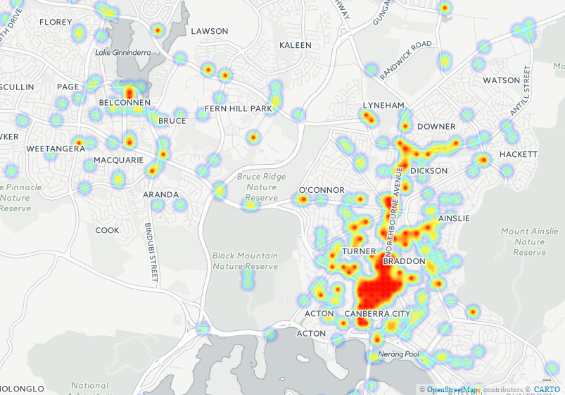
Here’s a heat map I made out of the ACT Cyclist crash data with Carto:

act_cyclist_crashes_1_by_u3068541_09_22_2016_08_09_00

Fiddling with the map settings in Carto seems both incredibly useful, but it some ways, illicit. Just by adjusting how the data is represented, I can paint a different picture, without altering the data. For example, with the heat-map, I can increase of decrease the size value of each crash. Increasing the size of each point, increases the ‘heat-density’ of Northborne Ave significantly. I’m not altering the data, but the perception of the data, but when I’m using a map such as this to represent data viewers might not look at, is there much difference?

I’m currently trying t make a rectified map of Canberra using Map Warper, but I’ll finish my post while the jpg. is loading.

Certainly some interesting stuff this week, and incredibly useful for my project proposal (which I better get back to writing).

Thanks
Aiden


Week 7: how big is Australia REALLY?

Since my early introduction to west wing I have known about the why and how of the obscure map of the world and so this was nothing new to me. What was new was that funky map we got to play ‘The True Size of.” What a great tool and so educational.

What was really great about this weeks tutorial was we learned about maps and how to put data into them in such a way as to show off some really cool information. I mean just check out this map we created in Carto about bicycle accidents in Canberra (using data provided by Tim of course).

I am definitely looking forward to using this tool as part of my project.

Lastly, the best part (or rather the coolest) was looking at MapWarper. I won’t be using this tool in my project but I was really intrigued by it. The function of this tool is to place old maps over newly mapped locations. We took an old map of Melbourne and used this tool to warp it into shape over a ‘google map’ type of map background. It didn’t take a whole lot, just a few markers to give the tool a base to go off and then it did the rest. What you end up with is a modern map with the old map pasted over it and you can change the opacity so that you can see both maps at the same time. It’s a great tool and really shows how a place (Melbourne) has changed.

I really enjoyed this class.

Katie

Reflection for week 7

I really enjoyed looking at the uses for maps in this week’s information. In particular, The True Size of… was really cool I liked seeing how big various countries wee compared to each other and just how big Australia is, I wish that it worked on states in Australia or the equivalent in other countries as well. I got excited when I thought it would work until I realised it was only American states.

I also really thought the process of georectifying historical maps was clever, it is something that I had never thought about before. To be able to use historical maps with modern geospatial systems by distorting and aligning them to be functional opens up many possibilities it would be interesting to this with some of the earlier historic maps located at the New York Public Library and then use them to be able to show data relevant to the map and the world at the time.

Week 6 Reflection_Yizhuo Zhang u3125186

This week we have covered the data visualization. We can see visualized data anywhere in our life, like text book, newspaper, TV, or even on the menu. And Google Analytic also provide a good way for webmasters to view data visualized. I have studied ‘Networked Media Production’ in last semester, so I know how to use it.
.The 6 examples given is very good. Especially the ‘Mapping Police Violence’, it’s not only visualized, but also interactive. It can be used for data journalism. ‘A timeline of Earth’s average temperature’ is good, but not interactive, so probably it’s better for education use. But it can be transformed to interactive, because I think people would like to ‘explore’ rather than be ‘feed’.
For the bar chart I created in Plotly, I think group mode is more effective. Because it can ‘compare’ which is more, even slightly differences. But we can’t see small differences under stack mode.
I think ‘Dataviz Catalogue’ is great tool for me to find suit online tool for data visualization, very quickly and comparable.
‘Charted’ is super easy to use, but however, just as mentioned in the handbook, it’s customized option is very limited! I don’t think ‘less is more’ applied in here, because people will finally abandon products with less functions, and use similar one with more and better functions. Just like iOS, it’s simple, but it’s also constantly add more functions and improvements.
And I have completed the challenge.

media-20160916

Wk6

I really enjoyed playing around with the visualisation on the Republic of Letters website. It provided multiple chart types that showed information in a clear manner with titles or tags that assisted in making sense of the information presented. I particularly liked the Top Cities and Corresponders part as it is a quick and easy way of showing the main cities in that time period and the major historical figures.


Alternatively, I struggled with making sense of what I was looking at on the Kindred Britain website. I understood what they were aiming for though the dropdown box describing the site, unfortunately how the information was presented did not reflect the outlined intention.

Looking at the differences between how I interacted with these two sites, to me shows how important using the correct visualisation is, as well as using clear titles and tags to allow viewers to fully engage with the information provided.

Week 6 Reflection

Good Afternoon,

Here we go, Data visualisation. Whilst working though the various visualisations this week, I was thinking about how I could use these in terms of the proposal due very soon, and I think many of these will be quite useful. For my project, I’m thinking of using AIATSIS and AUSTLANG data on indigenous languages of Australia. I’ve seen plenty of language maps, such as this, and I’m trying to figure out what I can bring to the table. All I can say is that most of the visualisations i have seen have been static, perhaps I can create a more interactive version of the map I’ve just linked? But what would that look like? Let me know if this has been done and I just haven’t done my research.

Anyways, here’s proof that I did stuff for week 6.

Internet Access by Age – Pie Chart & Column Chart

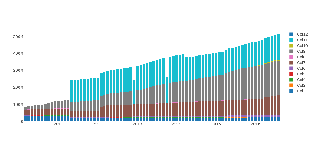
Trove Work Counts 2010-2016 – Plot.ly Stacked Bar Graph

RAW:trove-work-counts-2010-2016-raw

Trove Closed Links – Fusion Table

When I was testing out the physics of the fusion table (which is mesmerising) I shook one of the major points, and a triplet of point shot out from the rest, showing that those three closing reasons were only ever used with each other. That’s something I probably wouldn’t have noticed had the chart been static, let alone from the raw data.

Alright, better get on to the proposal.

Cya!

Reflection Week 6

I enjoyed this weeks class on data visualisation, I particularly liked comparing the different methods of showing data and the positives and negatives of each variant we assessed. Mapping Police Violence I found very powerful, the flashing lights representing deaths really showed data in a much more emotional and tangible way. For this reason, it was my favourite although the others were interesting I think that it and the Origin of species really communicated the data well and in the most powerful ways.

Of all the various chart type available to use I really enjoy the way the Reingold-Tilford tree shows hierarchies and I will definitely use it whenever practical in the future. Raw makes it so easy and fast to try various visualisations I really think it will be useful. I definitely prefer plot.ly. to charted though, I appreciate the greater freedom as well as tools you have at your disposal with plot.ly.


Week 6 Visualising Data

In previous weeks we have looked at data in numerical or even alphabetical form, and I think we got a lot out of that information such as trends as well as what data is out there, where and how to get it. However a lot of data is very boring to look at and very long. This means, in particular for humanities data it looses a lot of its feeling and understanding. This week we looked at tools that can take in data and then churn it out in one of the visualisations, and how much customisation we can do like in Plotly and Raw. Examples like Mapping Police Violence and The Preservation of Favoured traces utilise movement and colour to very effectively and viscerally portray data. Mapping Police Violence had data points pop up like gun shots, and the rate at the changes of The Origin of the Species physically showed the theme of the progress of science. I thought these were really fascinating examples and summed up what we were trying to identify and explore in the class. Although I am more interested in mapping for my project I gained from the class that some visualisations match some data better, which can help me in selecting visual components for my project.


Here is my stacked bar graph using plotly rather than QueryPic


css.php